Aug 19, 2026
Havo-P
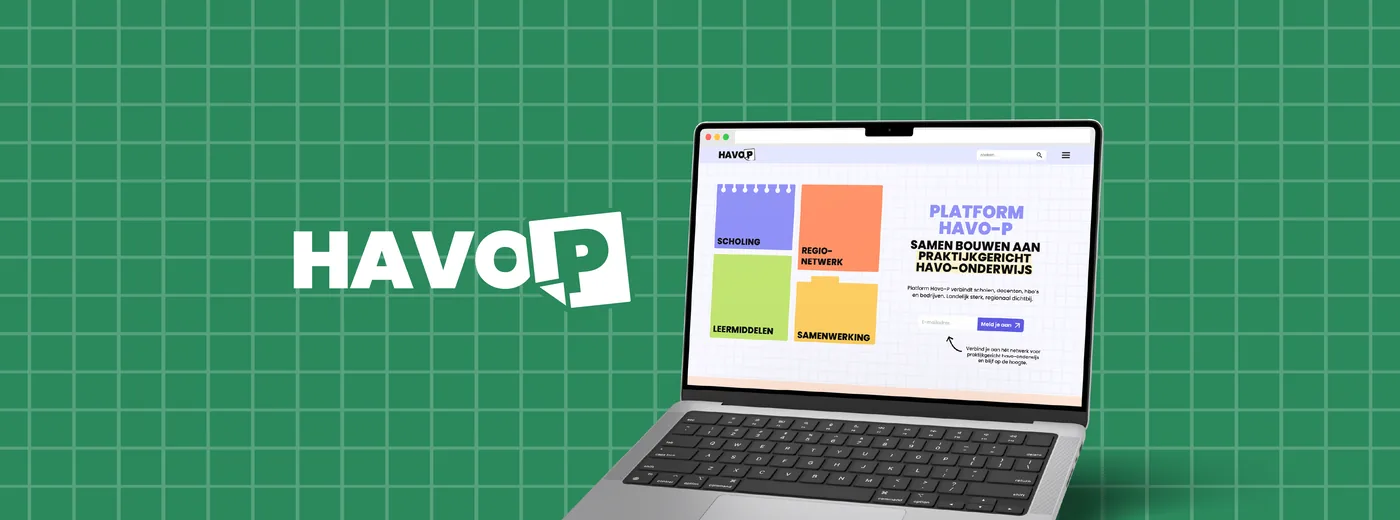
Frontend and WordPress plugin work for Platform Havo-P, a national network for practice-oriented havo education.
- B302
- frontend
- WordPress
- plugin
Platform Havo-P connects schools, teachers, hbo institutions and companies around practice-oriented havo education. The platform brings together knowledge, training, teaching materials, regional networks and collaboration.
I worked on this project at B302 as a frontend developer.
The project
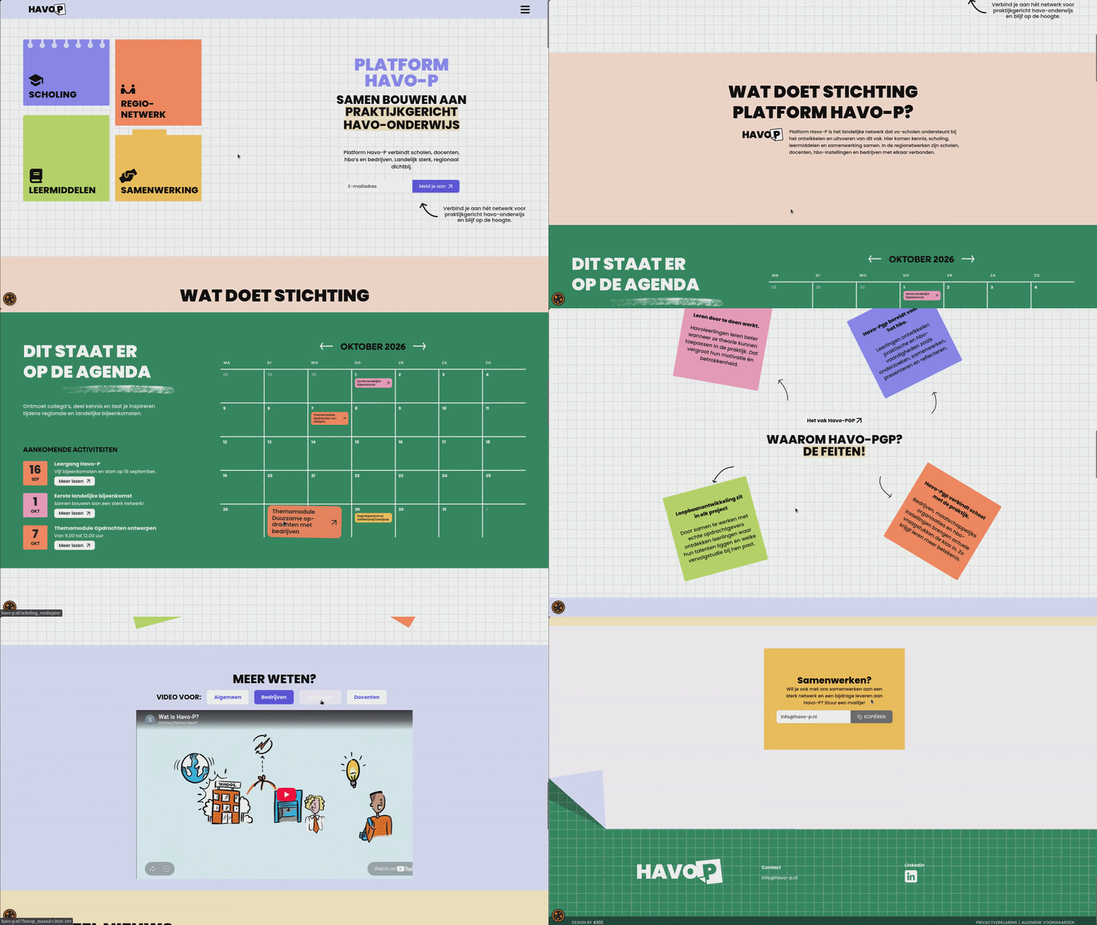
Havo-P is about making havo education more practical. The platform helps schools and teachers find support, events, regional contacts and learning materials. On the public website this comes together in pages for scholing, regionetwerk, samenwerking and leermiddelen.
For the client it was important that the website did more than show information. They needed specific WordPress functionality that matched how they organise scholing and events.
Visual identity
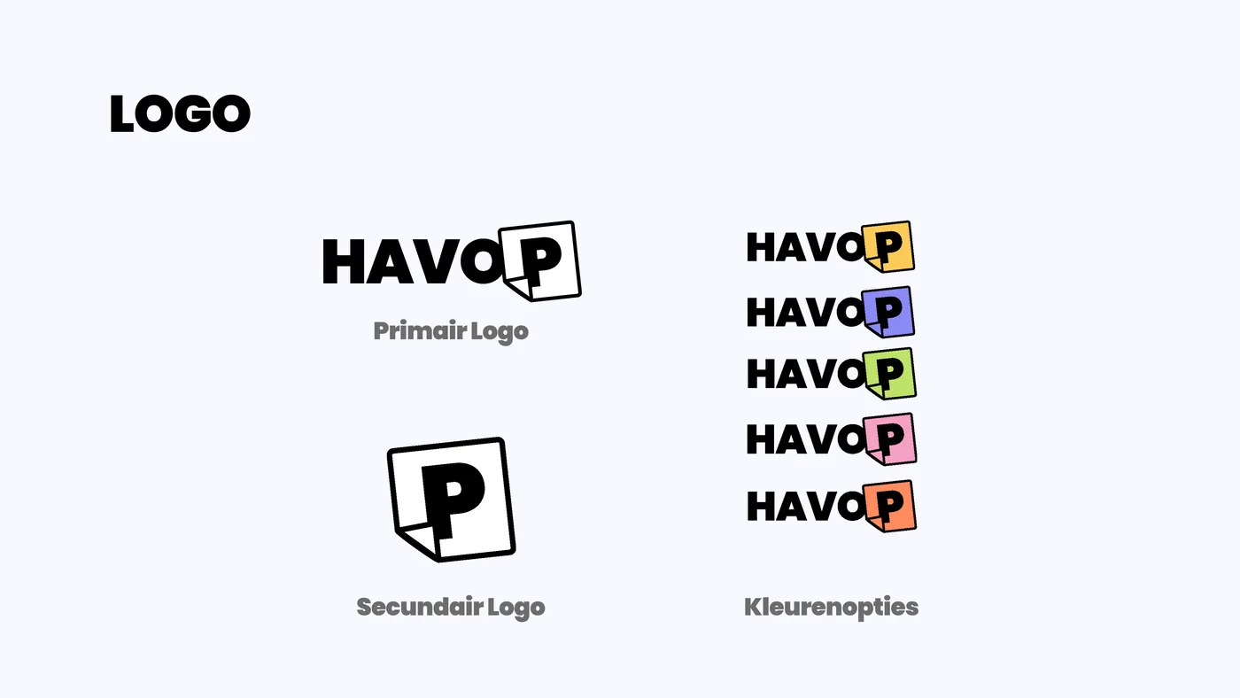
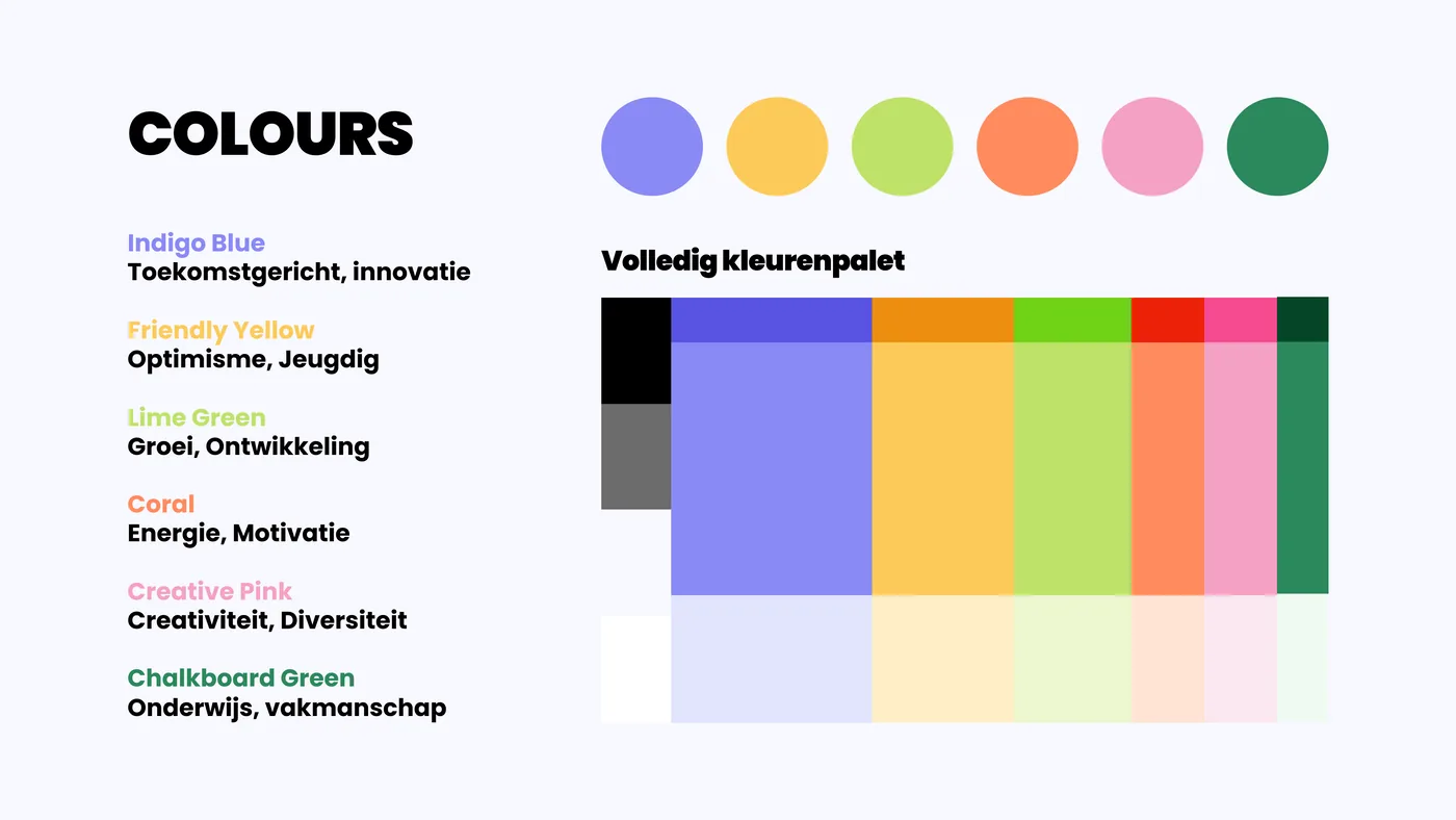
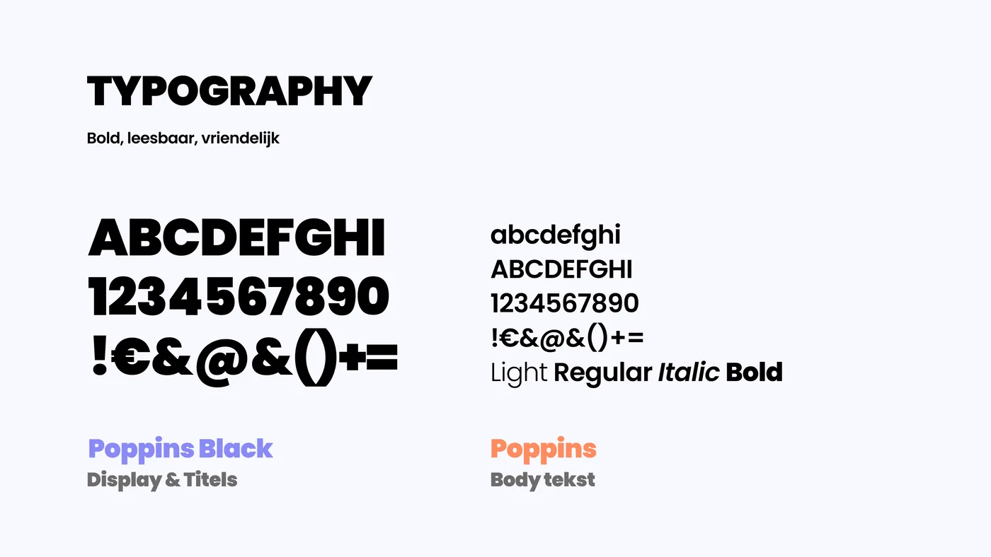
The platform has a bold, colourful visual identity. Everything from the logo to the colour palette was designed to feel energetic and approachable — fitting for a national education network aimed at teachers and schools.
My role
I worked together with one other developer, multiple designers and a project manager. My focus was frontend development and turning the designs into a working WordPress experience.
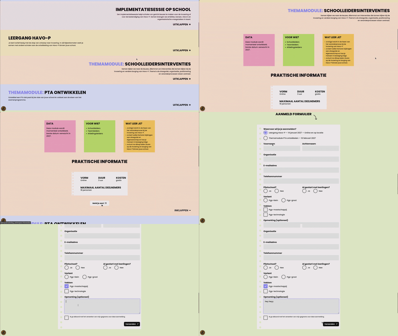
We also custom built a WordPress plugin for the client’s specific scholing needs. That included functionality such as:
- a calendar for scholing and events;
- registration flows for participants;
- custom forms for the platform;
- content management that fits how the Havo-P team works.
Pages and features
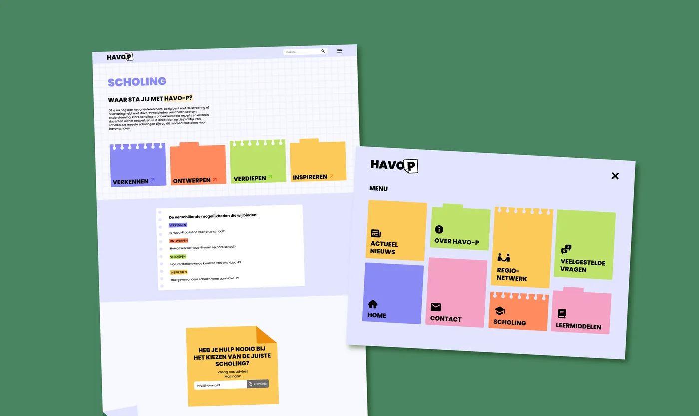
The site has a playful visual style with colourful blocks, strong typography and a grid background. Translating the design system into WordPress meant keeping the frontend close to the original designs while still being manageable for the Havo-P team to maintain.
What I learned
This project was a good mix of frontend work and client-specific WordPress development. I learned a lot about working in a larger team, matching design details, and building plugin functionality around real organisational needs instead of generic WordPress features.