Sep 14, 2026
Declarative Desktop Rice
A flake-driven NixOS desktop built around square geometry, muted technical blue, serif/mono typography, and a calm Wayland workflow.
- nixos
- rice
- wayland
- niri
- sway
- home-manager
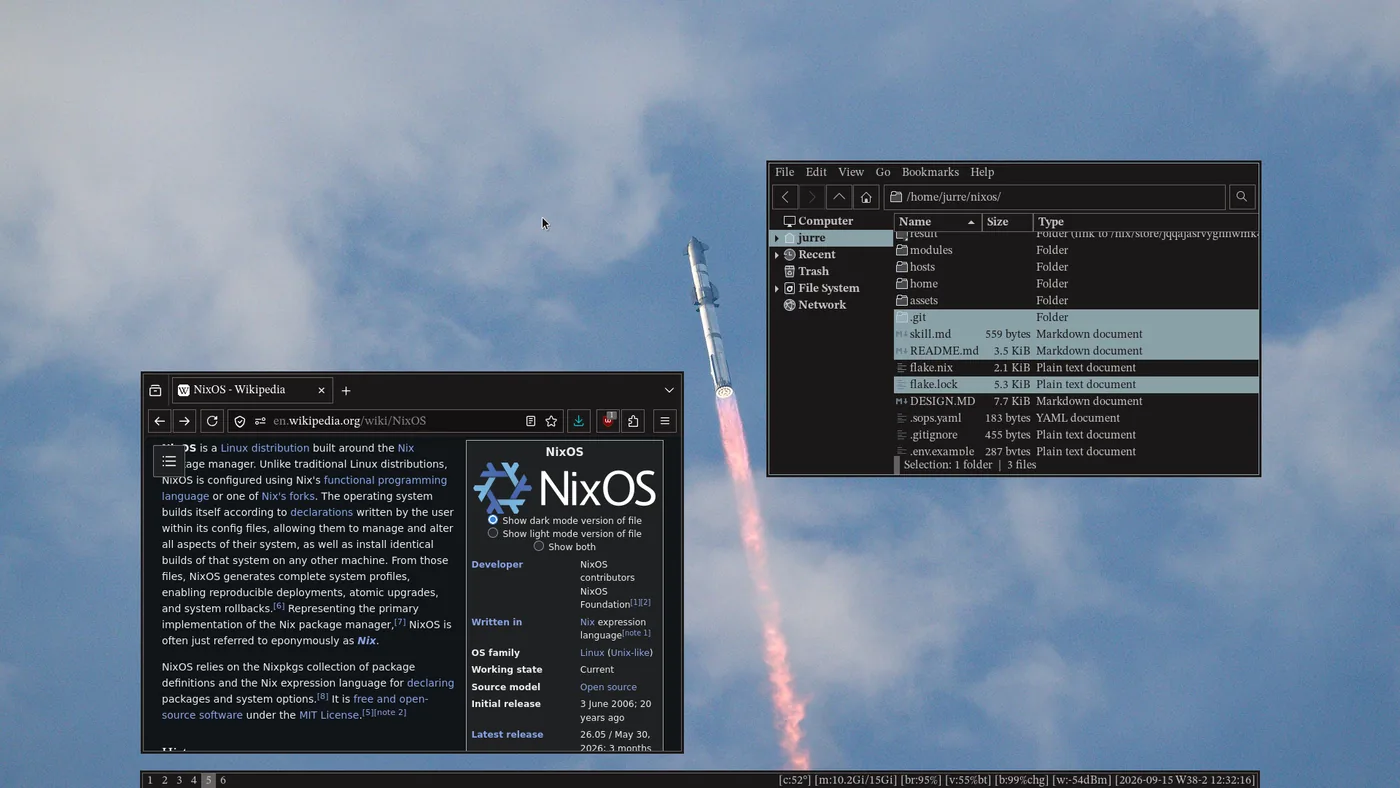
I just finished my NixOS desktop rice. The short version: it is dark, square, declarative, and intentionally restrained.
The longer version is that I wanted the desktop to feel like a technical workstation without becoming a retro-terminal costume. The theme is modern first, but it borrows discipline from academic typography and old technical interfaces: thin borders, compact spacing, muted colors, serif/mono contrast, and no decorative softness.
Drop the finished full-desktop screenshot here: tiled windows, wallpaper, bottom bar, and the square border language.
The styling rule I kept coming back to
The design file in my NixOS repo says this:
Modern interface. Old-school discipline.
That became the whole direction. I did not want gradients, glow, glassmorphism, pills, big SaaS cards, or fake sci-fi terminal styling. I wanted something calmer: a desktop that looks designed, but still feels like a tool.
The result is not flashy. That is the point. It is designed to disappear while I work, but still have a clear identity when I look at it.
The theme is a Nix value
The most important part of the rice is that it is not just a screenshot or a set of dotfiles copied into ~/.config. The visual language lives in one Nix theme object:
# themes/theme.nix
import ./hue-gradient-design.nix
Then the flake passes that same object into NixOS and Home Manager:
# flake.nix
nixosConfigurations.nixos-usb = nixpkgs.lib.nixosSystem {
  system = "x86_64-linux";
  specialArgs = {
    inherit inputs;
    theme = import ./themes/theme.nix;
  };

  modules = [
    ./hosts/nixos-usb/configuration.nix
    home-manager.nixosModules.home-manager
    {
      home-manager.extraSpecialArgs = {
        inherit inputs;
        theme = import ./themes/theme.nix;
      };
      home-manager.users.jurre = import ./home/default.nix;
    }
  ];
};
That means every module can use theme.colors, theme.fonts, theme.geometry, and theme.layout without redefining the same decisions.
{ config, pkgs, theme, ... }:

let
  c = theme.colors;
  f = theme.fonts;
  g = theme.geometry;
in {
  # use c.accent, f.mono, g.border.width, etc.
}
This is the part that makes it feel like NixOS: the rice is reproducible infrastructure.
Palette: warm black, muted text, technical blue
The palette starts with #1b1818, which is almost black but still warm. The surfaces step up gently from there, and the primary accent is #8aa1a8: a desaturated blue that feels technical without screaming for attention.
#1b1818
#252121
#302b2b
#c4c1c1
#8aa1a8
#a5bbc2
#9fc7c4
#d7ffc3
In Nix, those tokens are just data:
colors = {
  background = "#1b1818";
  surface = "#252121";
  surfaceAlt = "#302b2b";

  text = "#c4c1c1";
  textMuted = "#918c8c";
  textFaint = "#777272";

  border = "#666262";
  accent = "#8aa1a8";
  accentBright = "#a5bbc2";
  accentSoft = "#9fc7c4";
  highlight = "#d7ffc3";
};
I use #8aa1a8 for active elements, links, selection, and primary interaction. #a5bbc2 is reserved for stronger focus feedback. #d7ffc3 exists, but only as a rare highlight; if everything is highlighted, nothing is.
Typography: human text versus machine text
I wanted the desktop to have a literary/academic texture without becoming decorative. So I split the typography into two roles:
- STIX Two Text for interface language: headings, labels, menus, descriptions, browser UI, and GTK apps.
- IBM Plex Mono for machine language: terminal output, commands, dates, paths, IP addresses, stats, and exact values.
fonts = {
  serif = "STIX Two Text";
  serifItalic = "STIX Two Text Italic";
  mono = "IBM Plex Mono Text";
  monoItalic = "IBM Plex Mono Italic";

  roles = {
    display = { family = "STIX Two Text"; sizePx = 27; style = "normal"; };
    subheading = { family = "STIX Two Text"; sizePx = 18; style = "italic"; };
    technicalMetadata = { family = "IBM Plex Mono"; sizePx = 14; style = "normal"; };
    terminal = { family = "IBM Plex Mono"; sizePx = 16; style = "normal"; };
  };
};
The italic serif is a recurring signature. It appears in supporting text, captions, and secondary labels. Regular text carries the actual information; italic text provides the quieter human context around it.
Translating my design language into a desktop
I also used the design language file from Downloads as a reference point. Not as something to copy literally, but as a reminder that a strong visual system needs clear rules: typography choices, color roles, component states, and a consistent sense of rhythm.
Design language
Strong type hierarchy, clear brand colors, deliberate contrast, and reusable interface patterns.
NixOS desktop
Calm, technical, square, muted blue, serif/mono contrast, compact workstation rhythm.
The important lesson was consistency. My desktop does not need to copy every visual detail from the design file. It needs the same discipline: define the rules, then apply them everywhere.
Geometry: the anti-pill desktop
The geometry is deliberately strict:
geometry = {
  radius = 0;
  radiusPx = "0px";

  border = {
    width = 1;
    widthPx = "1px";
    emphasisWidth = 2;
    emphasisWidthPx = "2px";
  };

  focusOutline = {
    width = 2;
    widthPx = "2px";
    color = "#a5bbc2";
  };

  shadow = "none";
  boxShadow = "none";
};
Everything derives from that: GTK widgets, Firefox tabs, Rofi, Waybar, notifications, windows, dialogs, popovers, and scrollbars. If something has a corner, it gets flattened. If something has a decorative shadow, it gets removed.
Window borders and wallpaper
For Sway and Scroll, the theme maps directly to client colors and wallpaper. Focused windows use the accent color, inactive windows fall back to the structural border color, and urgent windows use semantic red.
# home/desktop/sway/theme.nix
wayland.windowManager.sway.extraConfig = ''
  default_border pixel ${toString g.border.width}
  default_floating_border pixel ${toString g.border.width}

  exec_always swaybg -i ${theme.wallpaper} -m fill

  font pango:${f.mono} ${toString f.sizes.ui}

  client.focused          ${c.accent} ${c.accent} ${c.text} ${c.accent} ${c.accent}
  client.focused_inactive ${c.border} ${c.border} ${c.text} ${c.border} ${c.border}
  client.unfocused        ${c.border} ${c.border} ${c.border} ${c.border} ${c.border}
  client.urgent           ${c.error} ${c.error} ${c.text} ${c.error} ${c.error}
'';
On Niri, the same idea becomes KDL generated by Home Manager:
# home/desktop/niri.nix
layout {
  gaps ${toString innerWindowGap}
  background-color "${c.background}"

  focus-ring { off; }

  border {
    width ${toString g.border.width}
    active-color "${c.accent}"
    inactive-color "${c.border}"
    urgent-color "${c.error}"
  }

  shadow {
    on
    softness 0
    spread 3
    offset x=0 y=0
    color "${c.background}"
  }
}
The “shadow” there is not a decorative drop shadow. It is used as a hard background-colored outer edge around the normal border, so windows stay visually crisp against the wallpaper.
The desktop stack
I like this architecture because the visual system is not trapped inside one app. The theme is a reusable object that different modules interpret in their own language.
GTK: making Libadwaita follow the system
GTK and Libadwaita apps often bring their own assumptions about spacing, corners, and surfaces. I override the standard variables so dark mode becomes my dark mode:
@define-color window_bg_color @bg;
@define-color window_fg_color @fg;
@define-color accent_color @blue;
@define-color accent_bg_color @blue;
@define-color headerbar_bg_color @bg;
@define-color popover_bg_color @bg;

button,
entry,
spinbutton,
combobox,
textview,
popover > contents {
  border: 1px solid @gray;
  border-radius: 0px;
  box-shadow: none;
}
And in Nix, that CSS is installed for both GTK 3 and GTK 4:
xdg.configFile."gtk-3.0/gtk.css" = {
  text = gtkCss;
  force = true;
};

xdg.configFile."gtk-4.0/gtk.css" = {
  text = gtkCss;
  force = true;
};
That gives normal apps the same visual grammar as the compositor: flat surfaces, square controls, 1px borders, and accent-blue focus.
Alacritty: the terminal as part of the theme
The terminal palette is not separate. It is the same color system with terminal-specific names:
programs.alacritty.settings = {
  font = {
    normal.family = f.mono;
    size = f.sizes.ui;
  };

  colors = {
    primary = {
      background = c.terminal.background;
      foreground = c.terminal.foreground;
    };

    cursor = {
      text = c.terminal.background;
      cursor = c.terminal.cursor;
    };

    normal = {
      inherit (c.terminal) black red green yellow blue magenta cyan white;
    };
  };

  cursor.style = "Block";
};Terminal screenshot placeholder: IBM Plex Mono, block cursor, muted terminal palette, and the custom NixOS fastfetch logo.
Waybar: compact machine metadata
The bar is intentionally small. It sits at the bottom, centered with side margins, and reads more like machine metadata than a traditional desktop panel.
programs.waybar.settings.mainBar = {
  position = "bottom";
  height = theme.layout.bar.height;
  margin-left = theme.layout.bar.sideMargin;
  margin-right = theme.layout.bar.sideMargin;

  modules-left = [ "niri/workspaces" ];
  modules-right = [
    "temperature"
    "memory"
    "backlight"
    "pulseaudio"
    "battery"
    "network"
    "clock"
  ];

  clock.format = "[{:%Y-%m-%d W%V-%u %H:%M:%S}]";
  memory.format = "[m:{used:0.1f}Gi/{total:0.0f}Gi]";
  temperature.format = "[c:{temperatureC}°]";
  battery.format = "[b:{capacity}%]";
};
That is exactly why IBM Plex Mono exists in the system. Dates, temperatures, memory values, and network strength should feel like exact values, not prose.
Rofi: a launcher, not a modal blob
Rofi became a thin top strip. It is 24px high, full width, and aligned like a command surface instead of a floating rounded card.
window {
  location: north;
  anchor: north;
  width: 100%;
  height: ${toString theme.layout.bar.height}px;
  border: 0px 0px ${g.border.widthPx} 0px;
  border-color: ${c.border};
}

entry {
  placeholder: "launch…";
  placeholder-color: ${c.textMuted};
  text-color: ${c.text};
  cursor-color: ${c.terminal.cursor};
  background-color: ${c.background};
}

element selected.normal {
  background-color: ${c.states.active};
  text-color: ${c.background};
}Launcher screenshot placeholder: top-aligned, compact, square, and keyboard-first.
SwayNC: notifications as a system side panel
Instead of scattering widgets around the desktop, SwayNC carries notifications, DND, power actions, MPRIS, and system information in a full-height right-side panel.
services.swaync.settings = {
  positionX = "right";
  positionY = "top";
  "control-center-positionX" = "right";
  "control-center-positionY" = "top";

  "notification-window-width" = theme.layout.notification.width;
  "control-center-width" = theme.layout.panel.width;
  "control-center-height" = -1;

  widgets = [
    "title"
    "dnd"
    "buttons-grid#power"
    "mpris"
    "notifications"
    "inhibitors"
  ];
};
The styling follows the same rule again:
.control-center {
  background: @bg;
  color: @fg;
  border: 1px solid @blue;
  border-radius: 0px;
  box-shadow: none;
}

.notification {
  background: @bg;
  color: @fg;
  border: 1px solid @gray;
  border-radius: 0px;
}Notification panel screenshot placeholder: right-side control center with square widgets and compact system controls.
Firefox and Obsidian are part of the rice too
I did not want the desktop to look coherent only until I opened a browser. Firefox gets the same background, same borders, and same hard corners through userChrome.css:
.tab-background {
  border-radius: 0px !important;
  background-color: #1b1818 !important;
  box-shadow: none !important;
  border: 1px solid #666262 !important;
}

#urlbar,
#urlbar-background {
  border-radius: 0px !important;
  box-shadow: none !important;
  border: 1px solid #666262 !important;
}
Obsidian gets a generated System Flat theme from the same Nix values. That means notes, browser chrome, terminals, launchers, and notifications all share the same constraints.
Browser screenshot placeholder: square tabs, square URL bar, muted dark chrome, and no visual noise.
Why it feels finished
The rice feels finished because the rules are clear enough that I do not have to keep inventing new styling decisions.
If I add another app, I already know the answer:
- background is
#1b1818 - normal border is
1px solid #666262 - radius is
0px - shadows are
none - active state is
#8aa1a8 - strong focus is
#a5bbc2 - human text is STIX Two Text
- machine text is IBM Plex Mono
That consistency is what makes the desktop feel like a system instead of a pile of themed apps.
And because it is NixOS, the styling is rebuilt the same way as the rest of the machine:
sudo nixos-rebuild switch --flake .#nixos-usb
home-manager switch --flake .#jurre
The wallpaper might be the first thing people notice, but it is not the rice. The rice is the constraint system: one theme, one geometry, one palette, one set of typography roles, wired through Nix.
Modern interface. Old-school discipline.